Implementing Twitter’s App Loading Animation in React Native
Twitter’s iOS app has a loading animation I quite enjoy.

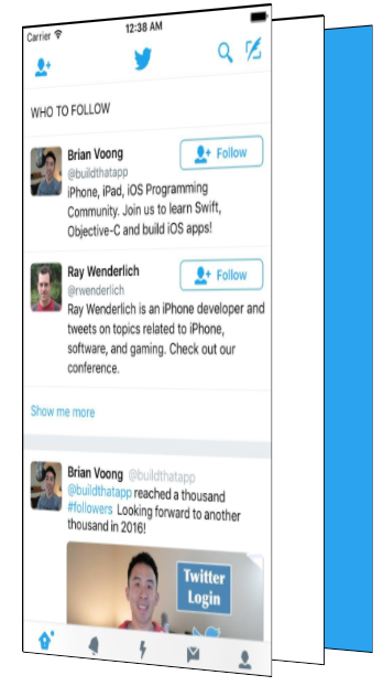
Once the app is ready, the Twitter logo delightfully expands, revealing the app.
I wanted to figure out how to recreate this loading animation with React Native.
To understand how to build it, I first had to understand the difference pieces of the loading animation. The easiest way to see the subtlety is to slow it down.

There are a few major pieces in this that we will need to figure out how to build.
- Scaling the bird.
- As the bird grows, showing the app underneath
- Scaling the app down slightly at the end
It took me quite a while to figure out how to make this animation.
I started with an incorrect assumption that the blue background and Twitter bird were a layer on top of the app and that as the bird grew, it became transparent which revealed the app underneath. This approach doesn’t work because the Twitter bird becoming transparent would show the blue layer, not the app underneath!
Luckily for you, dear reader, you don’t have to go through the same frustration I did. You get this nice tutorial skipping to the good stuff!
The right way
Before we get to code, it is important to understand how to break this down. To help visualize this effect, I recreated it in CodePen (embedded in a few paragraphs) so you can interactively see the different layers.

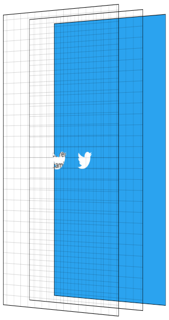
There are three main layers to this effect. The first is the blue background layer. Even though this seems to appear on top of the app, it is actually in the back.
We then have a plain white layer. And then lastly, in the very front, is our app.

The main trick to this animation is using the Twitter logo as a mask and masking both the app, and the white layer. I won’t go too deep on the details of masking, there are plenty of resources online for that.
The basics of masking in this context are having images where opaque pixels of the mask show the content they are masking whereas transparent pixels of the mask hide the content they are masking.
We use the Twitter logo as a mask, and having it mask two layers; the solid white layer, and the app layer.
To reveal the app, we scale the mask up until it is larger than the entire screen.
While the mask is scaling up, we fade in the opacity of the app layer, showing the app and hiding the solid white layer behind it. To finish the effect, we start the app layer at a scale > 1, and scale it down to 1 as the animation is ending. We then hide the non-app layers as they will never be seen again.
They say a picture is worth 1,000 words. How many words is an interactive visualization worth? Click through the animation with the “Next Step” button. Showing the layers gives you a side view perspective. The grid is there to help visualize the transparent layers.
Now, for the React Native
Alrighty. Now that we know what we are building and how the animation works, we can get down to the code — the reason you are really here.
The main piece of this puzzle is MaskedViewIOS, a core React Native component.
import {MaskedViewIOS} from 'react-native';

<MaskedViewIOS maskElement={<Text>Basic Mask</Text>}>
  <View style={{backgroundColor: 'blue'}} />
</MaskedViewIOS>;
MaskedViewIOS takes props maskElement and children. The children are masked by the maskElement. Note that the mask doesn’t need to be an image, it can be any arbitrary view. The behavior of the above example would be to render the blue view, but for it to be visible only where the words “Basic Mask” are from the maskElement. We just made complicated blue text.
What we want to do is render our blue layer, and then on top render our masked app and white layers with the Twitter logo.
{
  fullScreenBlueLayer;
}
<MaskedViewIOS
  style={{flex: 1}}
  maskElement={
    <View style={styles.centeredFullScreen}>
      <Image source={twitterLogo} />
    </View>
  }>
  {fullScreenWhiteLayer}
  <View style={{flex: 1}}>
    <MyApp />
  </View>
</MaskedViewIOS>;
This will give us the layers we see below.

Now for the Animated part
We have all the pieces we need to make this work, the next step is animating them. To make this animation feel good, we will be utilizing React Native’s Animated API.
Animated lets us define our animations declaratively in JavaScript. By default, these animations run in JavaScript and tell the native layer what changes to make on every frame. Even though JavaScript will try to update the animation every frame, it will likely not be able to do that fast enough and will cause dropped frames (jank) to occur. Not what we want!
Animated has special behavior to allow you to get animations without this jank. Animated has a flag called useNativeDriver which sends your animation definition from JavaScript to native at the beginning of your animation, allowing the native side to process the updates to your animation without having to go back and forth to JavaScript every frame. The downside of useNativeDriver is you can only update a specific set of properties, mostly transform and opacity. You can’t animate things like background color with useNativeDriver, at least not yet — we will add more over time, and of course you can always submit a PR for properties you need for your project, benefitting the whole community 😀.
Since we want this animation to be smooth, we will work within these constraints. For a more in depth look at how useNativeDriver works under the hood, check out our blog post announcing it.
Breaking down our animation
There are 4 components to our animation:
- Enlarge the bird, revealing the app and the solid white layer
- Fade in the app
- Scale down the app
- Hide the white layer and blue layer when it is done
With Animated, there are two main ways to define your animation. The first is by using Animated.timing which lets you say exactly how long your animation will run for, along with an easing curve to smooth out the motion. The other approach is by using the physics based apis such as Animated.spring. With Animated.spring, you specify parameters like the amount of friction and tension in the spring, and let physics run your animation.
We have multiple animations we want to be running at the same time which are all closely related to each other. For example, we want the app to start fading in while the mask is mid-reveal. Because these animations are closely related, we will use Animated.timing with a single Animated.Value.
Animated.Value is a wrapper around a native value that Animated uses to know the state of an animation. You typically want to only have one of these for a complete animation. Most components that use Animated will store the value in state.
Since I’m thinking about this animation as steps occurring at different points in time along the complete animation, we will start our Animated.Value at 0, representing 0% complete, and end our value at 100, representing 100% complete.
Our initial component state will be the following.
state = {
  loadingProgress: new Animated.Value(0),
};
When we are ready to begin the animation, we tell Animated to animate this value to 100.
Animated.timing(this.state.loadingProgress, {
  toValue: 100,
  duration: 1000,
  useNativeDriver: true, // This is important!
}).start();
I then try to figure out a rough estimate of the different pieces of the animations and the values I want them to have at different stages of the overall animation. Below is a table of the different pieces of the animation, and what I think their values should be at different points as we progress through time.

The Twitter bird mask should start at scale 1, and it gets smaller before it shoots up in size. So at 10% through the animation, it should have a scale value of .8 before shooting up to scale 70 at the end. Picking 70 was pretty arbitrary to be honest, it needed to be large enough that the bird fully revealed the screen and 60 wasn’t big enough 😀. Something interesting about this part though is that the higher the number, the faster it will look like it is growing because it has to get there in the same amount of time. This number took some trial and error to make look good with this logo. Logos / devices of different sizes will require this end-scale to be different to ensure the entire screen is revealed.
The app should stay opaque for a while, at least through the Twitter logo getting smaller. Based on the official animation, I want to start showing it when the bird is mid way through scaling it up and to fully reveal it pretty quickly. So at 15% we start showing it, and at 30% through the overall animation it is fully visible.
The app scale starts at 1.1 and scales down to its regular scale by the end of the animation.
And now, in code.
What we essentially did above is map the values from the animation progress percentage to the values for the individual pieces. We do that with Animated using .interpolate. We create 3 different style objects, one for each piece of the animation, using interpolated values based off of this.state.loadingProgress.
const loadingProgress = this.state.loadingProgress;

const opacityClearToVisible = {
  opacity: loadingProgress.interpolate({
    inputRange: [0, 15, 30],
    outputRange: [0, 0, 1],
    extrapolate: 'clamp',
    // clamp means when the input is 30-100, output should stay at 1
  }),
};

const imageScale = {
  transform: [
    {
      scale: loadingProgress.interpolate({
        inputRange: [0, 10, 100],
        outputRange: [1, 0.8, 70],
      }),
    },
  ],
};

const appScale = {
  transform: [
    {
      scale: loadingProgress.interpolate({
        inputRange: [0, 100],
        outputRange: [1.1, 1],
      }),
    },
  ],
};
Now that we have these style objects, we can use them when rendering the snippet of the view from earlier in the post. Note that only Animated.View, Animated.Text, and Animated.Image are able to use style objects that use Animated.Value.
const fullScreenBlueLayer = <View style={styles.fullScreenBlueLayer} />;
const fullScreenWhiteLayer = <View style={styles.fullScreenWhiteLayer} />;

return (
  <View style={styles.fullScreen}>
    {fullScreenBlueLayer}
    <MaskedViewIOS
      style={{flex: 1}}
      maskElement={
        <View style={styles.centeredFullScreen}>
          <Animated.Image
            style={[styles.maskImageStyle, imageScale]}
            source={twitterLogo}
          />
        </View>
      }>
      {fullScreenWhiteLayer}
      <Animated.View style={[opacityClearToVisible, appScale, {flex: 1}]}>
        {this.props.children}
      </Animated.View>
    </MaskedViewIOS>
  </View>
);

Yay! We now have the animation pieces looking like we want. Now we just have to clean up our blue and white layers which will never be seen again.
To know when we can clean them up, we need to know when the animation is complete. Luckily where we call, Animated.timing ,.start takes an optional callback that runs when the animation is complete.
Animated.timing(this.state.loadingProgress, {
  toValue: 100,
  duration: 1000,
  useNativeDriver: true,
}).start(() => {
  this.setState({
    animationDone: true,
  });
});
Now that we have a value in state to know whether we are done with the animation, we can modify our blue and white layers to use that.
const fullScreenBlueLayer = this.state.animationDone ? null : (
  <View style={[styles.fullScreenBlueLayer]} />
);
const fullScreenWhiteLayer = this.state.animationDone ? null : (
  <View style={[styles.fullScreenWhiteLayer]} />
);
Voila! Our animation now works and we clean up our unused layers once the animation is done. We have built the Twitter app loading animation!
But wait, mine doesn’t work!
Don’t fret, dear reader. I too hate when guides only give you chunks of the code and don’t give you the completed source.
This component has been published to npm and is on GitHub as react-native-mask-loader. To try this out on your phone, it is available on Expo here:

More Reading / Extra Credit
- This gitbook is a great resource to learn more about Animated after you have read the React Native docs.
- The actual Twitter animation seems to speed up the mask reveal towards the end. Try modifying the loader to use a different easing function (or a spring!) to better match that behavior.
- The current end-scale of the mask is hard coded and likely won’t reveal the entire app on a tablet. Calculating the end scale based on screen size and image size would be an awesome PR.
